How to add custom CSS to Shopify: options, examples, safety
Shopify gives you a Custom CSS box at theme level (1,500 characters, every page except checkout) and at section level (500 characters). Anything bigger belongs in your theme code, as an asset file or a stylesheet tag. Work on a duplicate theme, find selectors with browser DevTools, and write rules that survive theme updates.
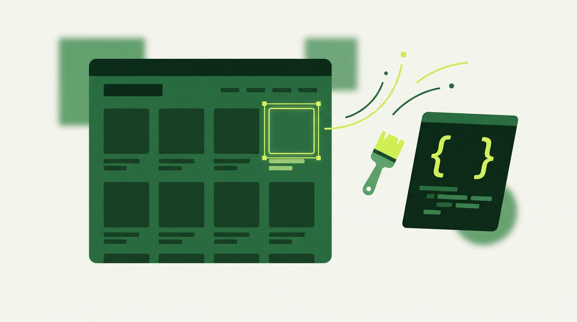
The short answer: use the Custom CSS box in the theme editor for small tweaks to the whole store (1,500 characters) or one section (500 characters). When you need more room, or want CSS that lives beside a section, put it in your theme code. Either way, work on a copy of the theme and write selectors that still match after the next theme update.
This guide is for store owners who can read a little CSS and developers handed a "make this look right" ticket. We rewrote it and checked it on 17 October 2026 against Shopify's Help Center and developer documentation, and ran every sample in a browser against Shopify's public Dawn demo store. If a step looks different in your admin, follow the linked page.
Which option to use
There are five places CSS can live. The first two are in the theme editor. The other three are theme code.
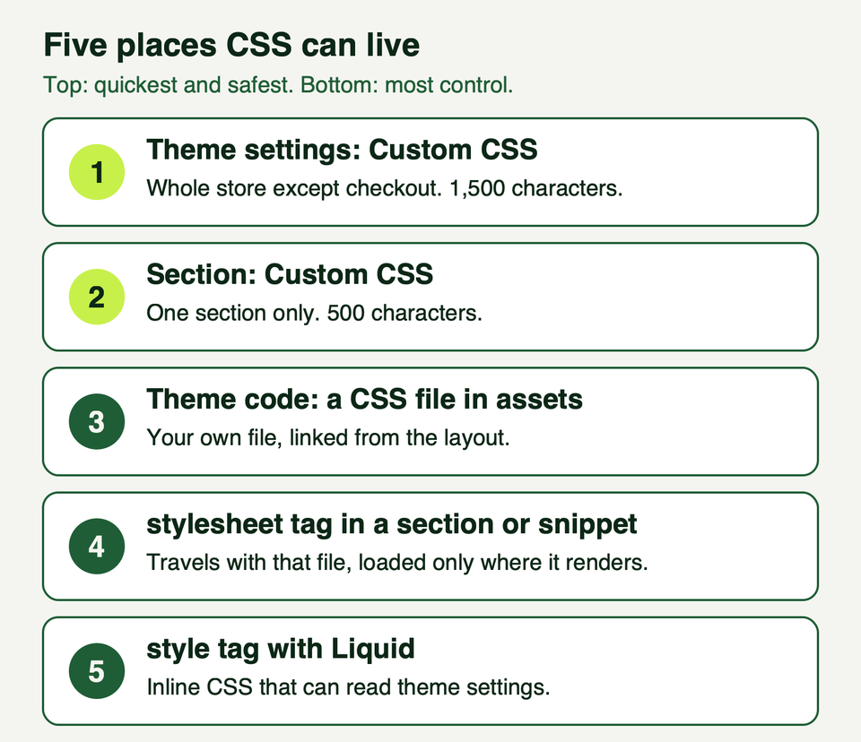
| Option | Where | Reaches | Limits |
|---|---|---|---|
| Theme Custom CSS | Theme settings, Custom CSS | Every page except checkout | 1,500 characters |
| Section Custom CSS | Bottom of a section's panel | That section only | 500 characters, few at-rules |
| Asset file | Edit code, assets folder | Wherever you link it | None stated |
| stylesheet tag | Inside a section, block or snippet | Pages that render that file | One tag per file |
| style tag | Liquid | Where you output it | None stated |
Our rule of thumb:
- Look for a theme setting first. Colours, fonts, spacing and corner radius are often settings already. Our guide to customizing the Dawn theme shows what they cover.
- If there is no setting and the change is small, use the Custom CSS box.
- Move to theme code when you hit the limits, need something the boxes block, or want CSS that travels with a section.
Shopify's Help Center says custom CSS works by overriding theme settings, so it takes precedence over them. A forgotten rule can make a setting look broken.
The Custom CSS boxes in the theme editor
For the whole theme: Online Store, Edit theme, Theme settings, Custom CSS, add code, Save. For one section: open the section in the editor, click Custom CSS at the bottom of its panel, add code, Save. Shopify documents both on Adding custom CSS to your theme.
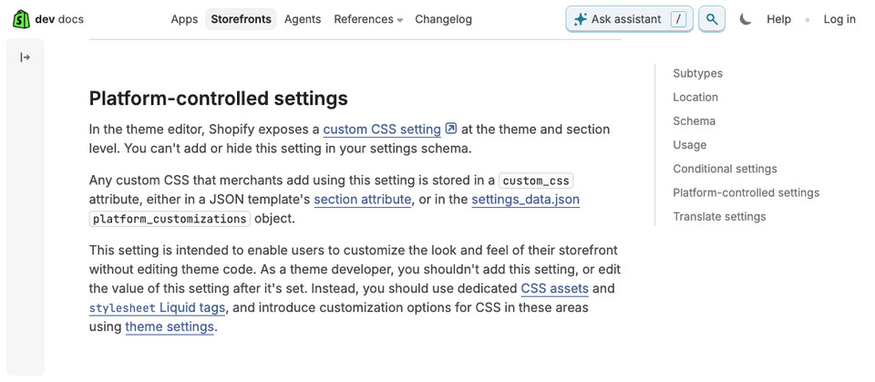
As of 17 October 2026 that page lists these limits:
- Theme CSS is capped at 1,500 characters, section CSS at 500.
@import,@charsetand@namespacecannot be used.- Section CSS allows only
@media,@container,@layerand@supports, and cannot target the wrapper with theshopify-sectionclass. - The
contentproperty is not available. - URLs can only point to
cdn.shopify.com. - Custom CSS is not supported on checkout.
The cap is small. Our three examples below total about 930 characters as written, so keep comments short. Anything needing content, such as decorative pseudo-elements, has to go in theme code.
Shopify's developer docs add that this CSS is stored as custom_css in a JSON template's section or in settings_data.json. For how sections are built, see sections and blocks.
Adding CSS in your theme code
From Online Store, open your theme's actions menu and choose Edit code. The Help Center page on editing theme code cautions that you can only edit a theme's code after purchasing it, and that code changes incompatible with a theme update are removed from the updated copy. Duplicate the theme first.
A CSS file in assets
This is our default when a store has more than a handful of overrides. Create assets/custom.css and link it with the stylesheet_tag filter, which outputs a standard link tag.
{{ 'base.css' | asset_url | stylesheet_tag }}
{{ 'custom.css' | asset_url | stylesheet_tag }}
Dawn loads its main stylesheet this way. Placing yours after it helps, but Dawn also loads component stylesheets from inside its sections, so do not rely on order alone.
The stylesheet tag
Sections, blocks and snippets can carry CSS in a {% stylesheet %} tag. Shopify gathers these into one generated styles.css.
<div class="featured-note">{{ section.settings.text }}</div>

{% stylesheet %}
  .featured-note { padding: 1.6rem; border-radius: 12px; }
{% endstylesheet %}
Shopify's JavaScript and stylesheet tags page sets the rules: one stylesheet tag per file, and no Liquid inside it.
A change to know about: Shopify's changelog, dated 23 April 2026, says that from 20 April 2026 it delivers only the stylesheet CSS for files rendered on each page. A class defined in one file and used in an unrelated file can go missing where the defining file is absent. Per Shopify's subsetting page, asset stylesheets, inline styles and style tags are not affected. So shared, site-wide classes belong in an asset file.
The style tag
The Liquid {% style %} tag renders Liquid, so use it when CSS should follow a theme setting. Setting names differ between themes.
{% style %}
  :root { --accent: {{ settings.colors_accent_1 }}; }
{% endstyle %}
Our Liquid templating guide goes deeper.
Find the right selector with DevTools
Most failed CSS is a wrong selector, so look at what the theme outputs.
- Right-click the element and choose Inspect.
- In the Elements panel, check the selected node is the one you mean.
- Read the Styles pane. It lists every matching rule with its file and line, and strikes through overridden declarations.
- Use the Computed tab for the final value.
- Try values live. Edits vanish on reload, so copy what works. Chrome documents this in View and change CSS.
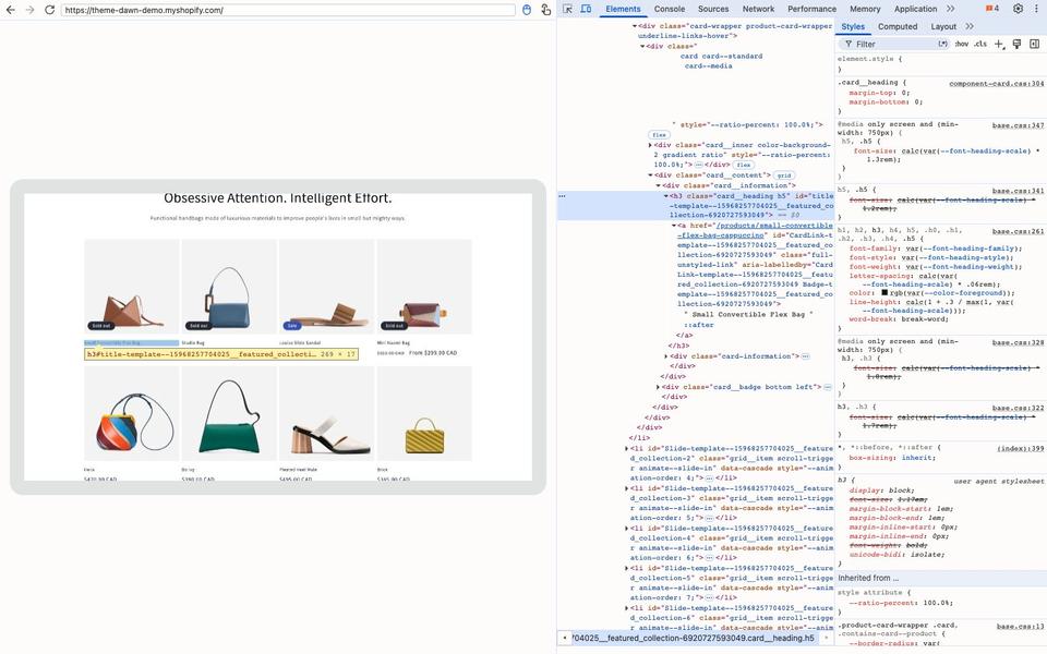
Here we selected a Dawn product title: an h3 with classes card__heading and h5. The Styles pane shows a short .card__heading rule from component-card.css and generic heading rules from base.css with font sizes struck through. That is the cascade at work, and it tells you which class to target.
- Prefer readable classes such as
.card__heading. Avoid ids like#shopify-section-template--15968257704025__featured_collection. They belong to one section instance and can change. - Watch for overlays. Our first click landed on a
::afterpseudo-element Dawn stretches across the card to make it clickable. Pick the heading in the Elements tree instead.
Why your CSS does not apply
If your rule appears in the Styles pane but is struck through, something beat it. The browser weighs importance, then cascade layers, then specificity, then source order.
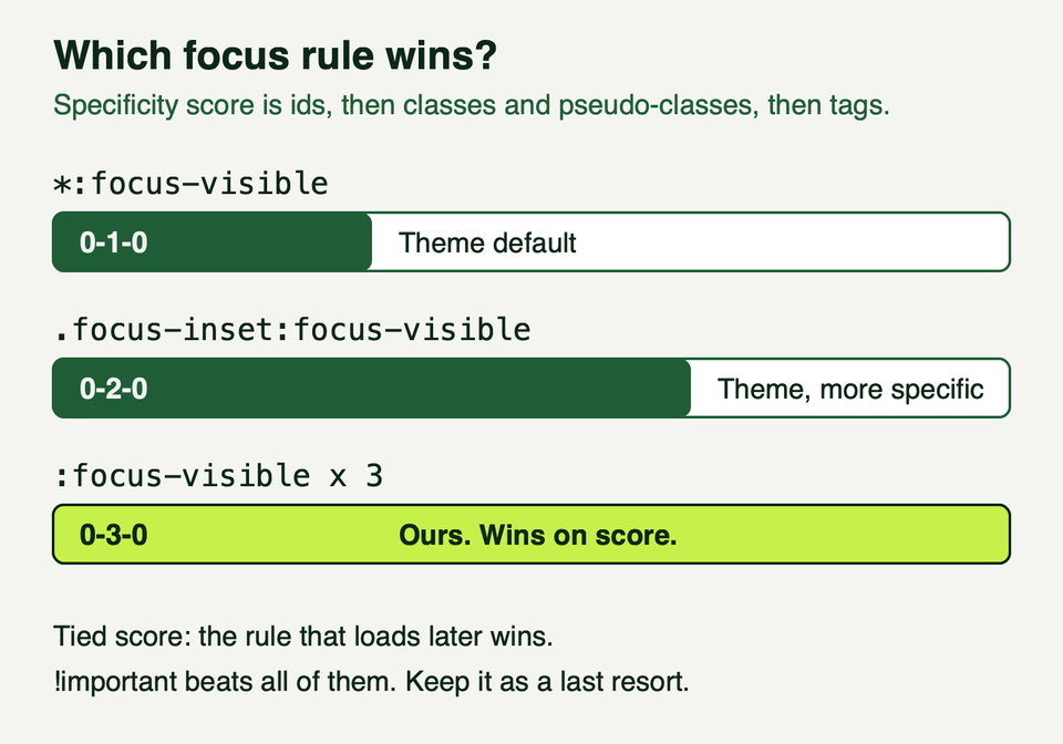
Specificity counts ids, then classes and pseudo-classes, then element names. MDN's specificity guide notes that the universal selector and :where() add nothing. Ties go to the later rule. Our ladder, gentlest first:
- Match the theme's selector and add one class. If the theme styles
.card__heading, write.card-wrapper .card__heading. - Repeat a pseudo-class.
:focus-visible:focus-visible:focus-visibleoutscores.focus-inset:focus-visible. Add a comment saying why. - Use
!importantonly for rules that must win everywhere. It also beats your own later rules.
Layers have a trap. MDN says styles not in a layer always override layered styles. Dawn's base.css on GitHub has no @layer rules, so wrapping your overrides in a layer to look tidy would make them lose.
Three tested examples
We injected each snippet into Shopify's public Dawn demo store (theme-dawn-demo.myshopify.com) in Chrome on 17 October 2026, at 1,440 and 390 pixel widths. That does not touch any store. We could not paste into a Custom CSS box here, so confirm your box accepts each rule. We did not test Safari or Firefox. Selectors are Dawn's; inspect your own theme first. All three total about 930 characters.
A sticky announcement bar
Dawn's bar scrolls away. This pins it and moves the sticky header down so they stack. Use the theme-level box.
:root { --bar-h: 39px; }
.announcement-bar-section { position: sticky; top: 0; z-index: 5; }
.shopify-section-header-sticky { top: var(--bar-h); }
.shopify-section-header-hidden { top: calc(var(--bar-h) - var(--header-height)); }
html { scroll-padding-top: calc(var(--bar-h) + var(--header-height) + 1rem); }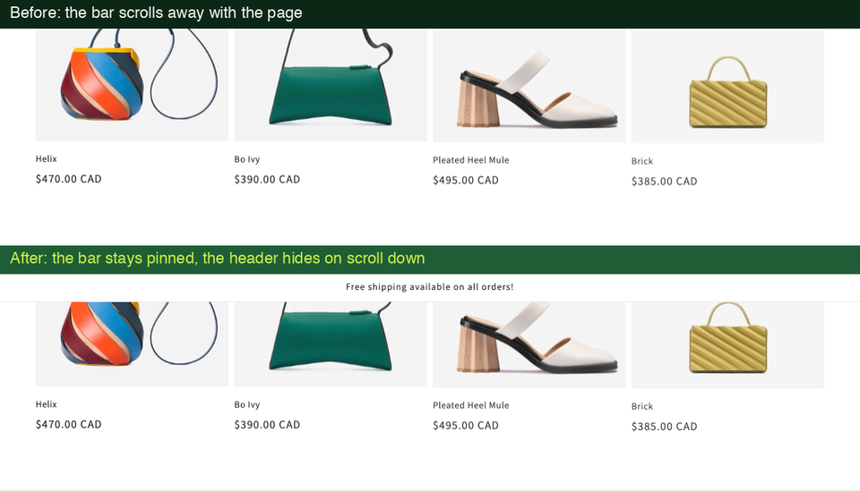
- The bar measured 39 pixels at both widths. Measure yours and change
--bar-h. A bar that wraps on phones is taller. z-index: 5beats Dawn's header at 3, so the header slides behind the bar when it hides.--header-heightis a variable Dawn sets. Other themes will not have it.- The last rule is for accessibility. Without it a link target landed at 0 pixels, under the sticky bars. With it, 134 pixels down. WCAG 2.2 criterion 2.4.11 Focus Not Obscured (Minimum) asks that a focused item is not entirely hidden by content you added.
- In the demo the header hides on scroll down and returns on scroll up. If yours is always visible, retest.
Tidier product cards
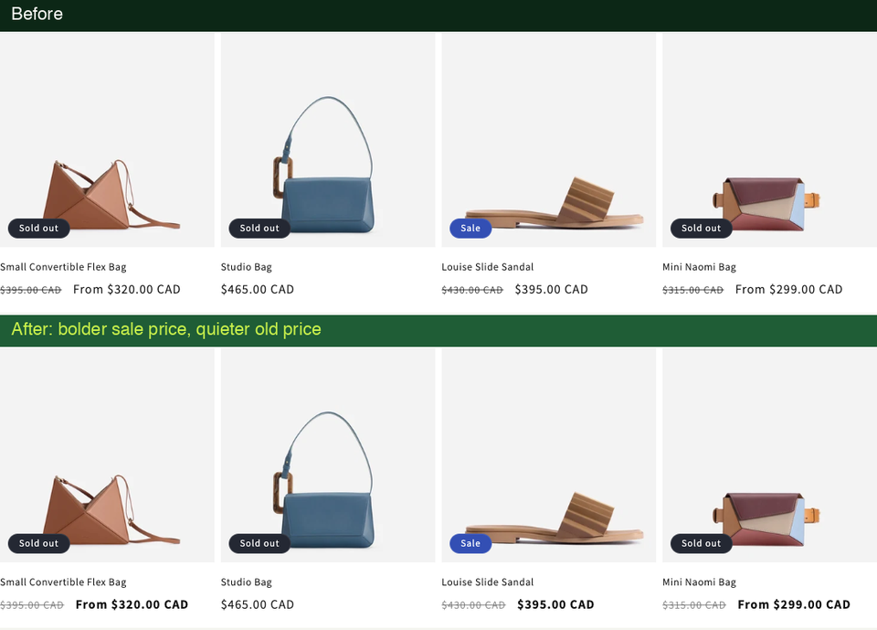
This clamps long titles to two lines, aligns price digits and quiets the struck-through old price so the sale price leads.
.card-wrapper .card__heading a {
  display: -webkit-box;
  -webkit-box-orient: vertical;
  -webkit-line-clamp: 2;
  line-clamp: 2;
  overflow: hidden;
}
.card-wrapper .price { font-variant-numeric: tabular-nums; }
.card-wrapper .price__sale s { font-size: 0.85em; opacity: 0.65; }
.card-wrapper .price-item--sale { font-weight: 600; }
@media (max-width: 749px) {
  .card-wrapper .card__heading { font-size: 1.4rem; }
}
- With a long title injected into one card, the link was five lines tall on desktop and six on a phone. With the CSS, two on both. The full title stays in the page for screen readers.
- The old price at 65 percent opacity is still about 5.8 to 1 against white by our calculation, above the 4.5 to 1 in WCAG 1.4.3.
- The clamp sits on the link, not the heading. When we put
overflow: hiddenon theh3, the keyboard focus ring was clipped and vanished. - Dawn exposes card corner radius, border and shadow through variables (we saw
--product-card-corner-radius), so use theme settings for those.
A visible focus ring
Dawn draws a grey outline at 50 percent opacity, about 3.5 to 1 over white by our calculation. That only just clears the 3 to 1 minimum for interface components in WCAG 1.4.11. This ring is solid and follows each section's colour scheme.
:focus-visible:focus-visible:focus-visible {
  outline: 3px solid rgb(var(--color-foreground, 18, 18, 18));
  outline-offset: 3px;
  box-shadow: 0 0 0 3px rgb(var(--color-background, 255, 255, 255));
}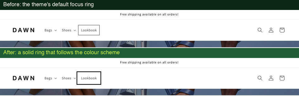
:focus-visibleshows the ring for keyboard users without drawing it on every click (MDN). WCAG 2.4.7 requires a visible indicator at level AA.- The tripled pseudo-class beat Dawn's
.focus-inset,.buttonand*focus rules. We tabbed through header links, buttons, fields and the footer and each showed the new ring. --color-foregroundand--color-backgroundare Dawn's per-scheme colours, so a dark scheme gets a light ring. The values after the commas are fallbacks.- In forced-colors modes such as Windows high contrast, MDN says
box-shadowis forced to none. The outline is still drawn, so the ring survives. - A 3 pixel offset can be clipped by
overflow: hiddenparents. Tab through your header, slideshow and drawers.
Mobile, colour schemes and dark mode
Mobile. Dawn's stylesheet pairs min-width: 750px with max-width: 749px rules and has a second breakpoint at 990px. Writing @media (max-width: 749px) fits the same split with no gap or overlap. Section CSS allows @media and @container. Test with the DevTools device toolbar and a real phone. Keep tap targets at least 24 by 24 CSS pixels (WCAG 2.5.8), and keep sticky bars to one line.
Colour schemes. Dawn colours each section through schemes you pick in the editor. In the demo each section carries a class such as color-background-1 or color-inverse that sets --color-foreground and --color-background. Use those variables and your CSS follows the section.
Dark mode. MDN describes prefers-color-scheme as the visitor's light or dark preference from their system or browser. Dawn's stylesheet has no prefers-color-scheme rules, so its colours do not follow the system. One dark-mode rule makes you responsible for every colour it touches, so a half-dark page is easy to create. Stay with colour schemes.
Motion. Wrap animation in @media (prefers-reduced-motion: no-preference) and animate transform and opacity, as Shopify's performance guidance prefers. See our theme accessibility guide for more.
Keeping changes safe, fast and tidy
Safe
- Duplicate the theme. Online Store, actions menu, Duplicate. The copy is named "Copy of" plus the theme name. Shopify allows 20 themes, so you may need to delete one.
- Edit the copy, preview, then publish. Change one thing at a time and save between changes.
- Know the undo. Each code file has a Timeline view that restores one file to an earlier version. It cannot restore a whole theme or a deleted file, history is finite, and restoring replaces the whole file, so copy the current contents first.
- Keep your own notes. Record each rule and why you added it, outside Shopify.
- Plan for updates. Shopify's updating themes page says editor customizations are copied over, code edits are included if they do not conflict, and if you added custom CSS you should check your selectors still exist and your CSS still applies. Review the "Updated copy of" draft before publishing.
More habits are in our piece on best practices for theme customization.
Fast
A few hundred characters of CSS cost almost nothing. The costs are elsewhere:
- Fonts. The Help Center says avoiding a performance hit from custom fonts is your responsibility. Shopify's guidance says each web font adds a render dependency and system fonts avoid it.
- Render blocking. web.dev lists render-blocking CSS in the head as part of the critical path. Shopify says styles for anything visible before scrolling should load synchronously.
- Stylesheet sprawl. Shopify warns that many separate stylesheet links cause costly style recalculation. Prefer one asset file.
Our theme performance guide covers measuring the result.
What not to do
- Do not paste CSS from a forum into the live theme without reading it.
- Do not use
outline: noneunless you replace the ring with something as visible. - Do not lean on ids or classes that include a section id. They change.
- Do not scatter
!important. Fix the specificity instead. - Do not hide legal links, prices or form labels because they look untidy.
- Do not edit the published theme directly, or expect theme CSS to affect checkout.
Frequently asked questions
Where do I add custom CSS in Shopify?
For the whole store, go to Online Store, Edit theme, Theme settings, Custom CSS. For one section, use Custom CSS at the bottom of its panel in the editor. For larger sets, open Edit code and link an asset file from the layout. Shopify says theme-level custom CSS applies to every page except checkout.
Is there a size limit?
In the editor boxes, yes. The Help Center says theme-wide custom CSS is limited to 1,500 characters and section CSS to 500. It also blocks @import, @charset, @namespace and the content property, and section CSS permits only @media, @container, @layer and @supports. The theme code pages we read state no such limits.
Will my custom CSS survive a theme update?
Not automatically. Shopify says editor customizations are copied to the updated theme and non-conflicting code edits are included, but depending on your selectors an update might stop your CSS working. Add the update as a draft, check your selectors still exist, and review the draft before you publish it.
Can I add custom CSS to checkout?
No. Shopify's Help Center says custom CSS is not supported on the checkout page, and the theme-level box reaches every page except checkout. Do not expect rules in your theme to change it. For checkout changes, ask a developer to review Shopify's current checkout customization documentation.
Why does my CSS work in DevTools but not on the store?
DevTools edits are temporary, so first check you saved. Then check whether a more specific theme rule beats yours, whether your selector matches what the Styles pane shows, and whether you put a section rule in the wrong section. Section CSS is scoped to its section and cannot target the section wrapper.
Where we can help
We build and maintain Shopify themes, including careful CSS changes that survive updates. If you want a second pair of eyes on your theme code, or someone to handle a bigger set of changes, see our services or get in touch.