Shopify theme accessibility: a practical WCAG 2.2 guide
To meet WCAG 2.2 level AA on Shopify, start from a well-built theme such as Dawn, then fix what no theme can fix for you: colour contrast, keyboard focus, heading order, alt text, form errors and moving content. Test with a scanner, a keyboard pass and a screen reader, because scanners find only part of the problems. This is a guide, not legal advice.

A Shopify theme meets WCAG 2.2 level AA when the pages a customer actually sees pass the checks, not when a theme's description says "accessible". A good starting theme such as Dawn gives you a sound structure. You still own six things no theme can settle for you: colour contrast, keyboard focus, heading order, alt text, form errors and anything that moves. Test them three ways (a scanner, a keyboard pass, a screen reader pass), because scanners find only part of the problems.
This guide is for store owners who need to know what to ask for, and developers who have the job in front of them. We rewrote it and checked its claims against the sources linked in the text on 17 October 2026. It is not legal advice.
What WCAG 2.2 AA asks of a store, in plain words
WCAG is a set of testable rules from the W3C. Each rule is a "success criterion" with a level: A, AA or AAA. The rules sort into four ideas: people can perceive the content, operate the controls, understand what is going on, and the page is robust enough for assistive technology to read.
WCAG 2.2 became a W3C Recommendation on 5 October 2023 (the current edition is dated 12 December 2024). W3C says it adds nine success criteria to 2.1 and removes one obsolete one, 4.1.1 Parsing. The rest is essentially unchanged, so aiming at 2.2 AA also covers the 2.1 AA list (What's New in WCAG 2.2). These are the criteria that matter most on stores, in our words:
| Criterion | Level | In plain words | Where stores trip |
|---|---|---|---|
| 1.4.3 Contrast (Minimum) | AA | Text has at least 4.5 to 1 against its background (3 to 1 for large text) | Grey text, text on photos |
| 1.4.11 Non-text Contrast | AA | Input borders, icons and focus rings reach 3 to 1 | Pale field borders |
| 2.4.7 Focus Visible | AA | You can see where keyboard focus is | Outlines removed, nothing added |
| 2.4.11 Focus Not Obscured | AA, new | A focused item is not completely hidden by your own content | Sticky bars, chat bubbles |
| 2.5.8 Target Size (Minimum) | AA, new | Targets are at least 24 by 24 CSS pixels, or well spaced | Tiny close buttons |
| 3.3.8 Accessible Authentication | AA, new | Logging in does not rely on a puzzle or on recall | Blocked paste |
| 2.2.2 Pause, Stop, Hide | A | Moving content lasting over five seconds can be paused | Auto-rotating slides |
The exact wording is in the WCAG 2.2 specification.
What Shopify gives you, and what stays yours
Shopify's accessibility statement says it uses WCAG 2.2 as its guiding principle, and also that merchants have complete control over their theme code (Shopify Accessibility Statement, updated 7 July 2025). That is the whole division of labour.
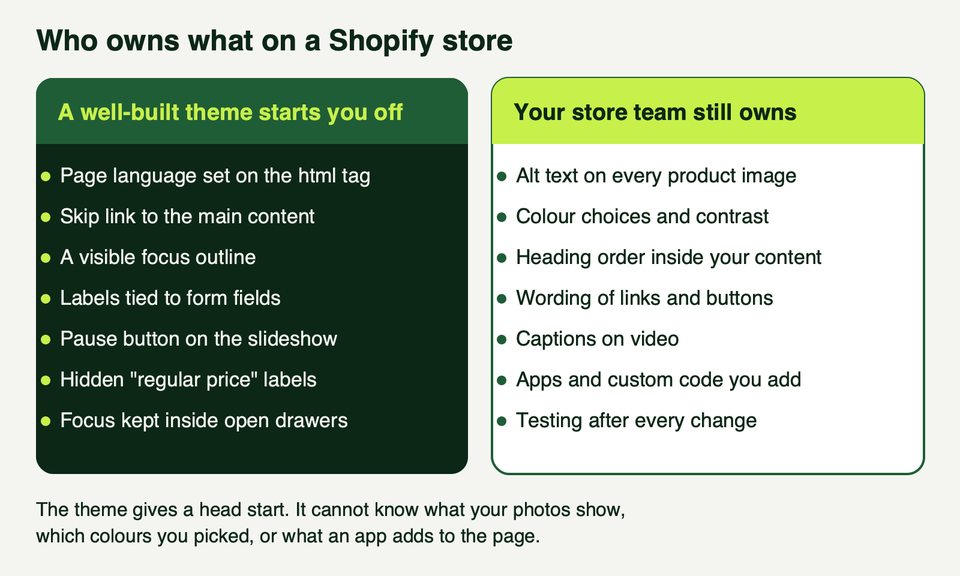
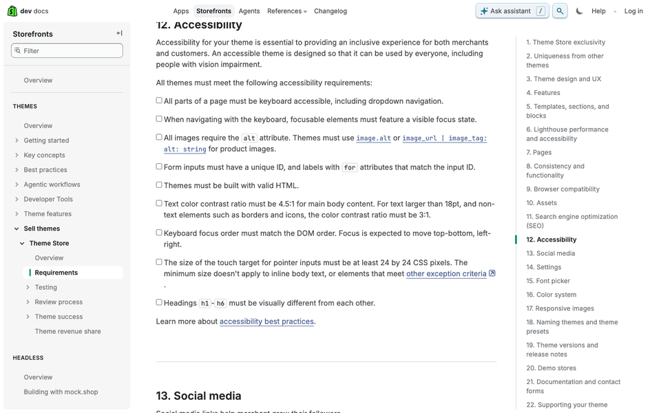
What the theme provides. Every Theme Store theme must meet accessibility rules, including keyboard access, a visible focus state, alt attributes, labelled inputs, valid HTML, the contrast ratios above, a 24 by 24 pixel minimum target, and an average Lighthouse accessibility score of at least 90 across the home, collection and product pages on desktop and mobile (Theme Store requirements).
We read Dawn's source (release 16.0.0, 10 August 2026) to see what that means in practice. It sets the page language, includes a skip link, draws a focus outline with :focus-visible, gives its slideshow a pause button, adds screen-reader-only price labels, traps focus inside drawers, and wires aria-invalid and aria-describedby to contact form errors (Dawn on GitHub).
Three honest limits.
- A Lighthouse 90 is a floor for listing a theme, not proof of conformance.
- Shopify's published Dawn conformance report is old: dated November 2021, covering Dawn 2.4.0 against WCAG 2.0 and 2.1 (Dawn VPAT). Your live theme is something else again, so treat its status as unknown until you test it.
- Dawn prints whatever alt text you saved. If the field is empty, the image has no description.
For context, WebAIM's 2026 survey of one million home pages found the 42,516 Shopify home pages in its sample averaged 75.1 detected errors, against 56.1 across all pages (The WebAIM Million, February 2026 data). The report does not say why, and it counts only what the WAVE tool can detect. It does show a Shopify store is not accessible by default.
The six problems that matter most on stores
WebAIM found six error types made up 96 percent of everything its scanner detected: low contrast text (83.9 percent of home pages), missing alt text (53.1), missing form labels (51), empty links (46.3), empty buttons (30.6) and missing page language (13.5). Our six cover those, plus the keyboard, structure and motion issues scanners miss.
1. Contrast and colour
Check body text, button text, placeholder text, sale prices, text on photos, input borders and icons against the table above, for every colour scheme in the theme.
Text over a photo is the usual failure, because the photo changes under the words. A dark overlay fixes the worst case: black at 55 percent opacity over a pure white pixel gives about #737373, and white text on that is about 4.7 to 1. At 50 percent it is only about 4.0 to 1, which fails.
/* file: assets/custom-hero.css */
.hero__media::after { content: ""; position: absolute; inset: 0; background: rgb(0 0 0 / 0.55); }
.hero__text { position: relative; color: #fff; }
Do not use colour alone to carry meaning. A red price needs a strikethrough, a label and text for screen readers too:
{%- if product.compare_at_price > product.price -%}
  <span class="visually-hidden">Regular price</span> <s>{{ product.compare_at_price | money }}</s>
  <span class="visually-hidden">Sale price</span> <strong>{{ product.price | money }}</strong>
{%- endif -%}
Our guide to adding custom CSS to Shopify covers where styles like these go safely.
2. Keyboard and focus
Put your mouse away and press Tab. You should reach every link, button and field, in reading order, and always see where you are.
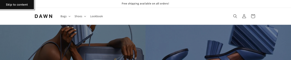
On Dawn's public demo store we pressed Tab from the skip link to the footer. It took 39 presses, the order matched the page, and we never got stuck. Dawn's focus ring is a thin outline in the text colour at 50 percent opacity, which by our arithmetic is about 3.5 to 1 against white and clears the 3 to 1 threshold. On a dark colour scheme or a photo, measure again.
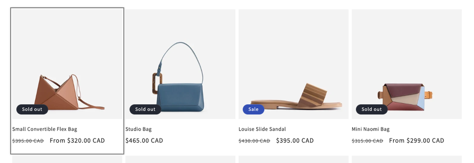
- Never remove outlines without a replacement.
:focus-visibleshows the ring for keyboard users and usually not for mouse clicks (MDN). - Stop sticky bars hiding focus.
scroll-padding-topoffsets scrolling for fixed toolbars (MDN). - Do not depend on hover. Menus and quick-add buttons that appear only on hover are invisible to keyboard users.
/* file: assets/custom-focus.css */
:where(a, button, input, select, textarea, summary):focus-visible {
  outline: 3px solid #000;
  outline-offset: 3px;
  box-shadow: 0 0 0 3px #fff; /* light band so the ring also shows on dark areas */
}
html { scroll-padding-top: calc(var(--header-height, 5rem) + 1rem); }
Drawers and pop-ups are the usual keyboard traps. The native <dialog> element makes the rest of the page inert while open and closes on Esc (MDN). We return focus ourselves so it never depends on the browser:
const drawer = document.getElementById('CartDrawer');
const opener = document.querySelector('[data-open-drawer]');
opener.addEventListener('click', () => drawer.showModal());
drawer.querySelector('[data-close-drawer]').addEventListener('click', () => drawer.close());
drawer.addEventListener('close', () => opener.focus());
Shopify's own best-practice page asks for 44 by 44 pixels on primary controls, while the Theme Store rule and WCAG 2.2 AA set 24 by 24 as the minimum. For pop-ups in particular, see our notes on pop-ups for Shopify.
3. Headings and landmarks
Screen reader users move through a page by headings and landmarks, the way sighted users scan. A page needs one h1, then h2 and h3 in order, and landmarks for the header, main content and footer. Shopify's guidance says headings should set the logical order, not be used for design.
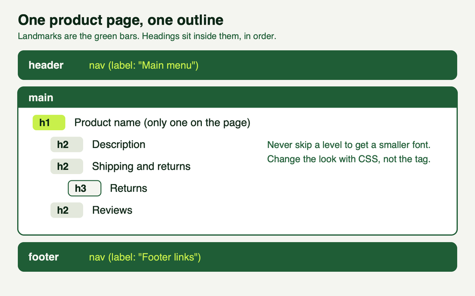
On a sections-based theme, merchants can drop sections in any order, so a hard-coded h2 may land under the wrong parent. Let the section choose its level and keep the size in a class (Dawn does something similar, for example an h2 carrying an h1 class). Our sections and blocks guide explains settings like this.
{%- assign tag = section.settings.heading_level | default: 'h2' -%}
<{{ tag }} class="h2">{{ section.settings.heading }}</{{ tag }}>

{% schema %}
{
  "name": "Feature text",
  "settings": [
    { "type": "text", "id": "heading", "label": "Heading", "default": "Why customers choose us" },
    { "type": "select", "id": "heading_level", "label": "Heading level", "default": "h2",
      "options": [ { "value": "h2", "label": "H2" }, { "value": "h3", "label": "H3" }, { "value": "h4", "label": "H4" } ] }
  ],
  "presets": [{ "name": "Feature text" }]
}
{% endschema %}
If a page has two nav regions, give each an aria-label, such as "Main menu" and "Footer links".
4. Alt text and images
Alt text is a merchant's job. Shopify's Help Center says to keep it brief and descriptive, with 125 characters or fewer recommended and a maximum of 512 (Adding alt text to media). Informative images get a description of what matters ("Charcoal wool coat, front view, buttoned", not "coat.jpg"). Decorative images get an empty alt="". Images that are links get text saying where the link goes.
In Liquid, image_tag fills alt from the media's alt text, or from the resource title for products and collections, and escapes it for you (Liquid reference).
{{ product.featured_image | image_url: width: 900 | image_tag }}

{%- if section.settings.divider_image -%}
  {{ section.settings.divider_image | image_url: width: 600 | image_tag: alt: '' }}
{%- endif -%}
The second image is decorative, so its empty alt is deliberate. Check the rendered HTML. WebAIM found 16.2 percent of home page images had no alt text at all, and caption any video that carries information.
5. Forms and error messages
Every field needs a visible label tied to it with for and id, a sensible autocomplete value, and an error that says what went wrong and where (WCAG 3.3.1). Status messages such as "Added to cart" must reach assistive technology without moving focus (4.1.3). Placeholders are not labels, because they vanish when someone types.
{%- form 'contact', id: 'ContactForm' -%}
  {%- if form.errors -%}
    <div id="FormErrors" role="alert" tabindex="-1">
      <h2>Please fix the following</h2>
      <ul>
        {%- for field in form.errors -%}
          <li><a href="#ContactForm-{{ field }}">{{ form.errors.translated_fields[field] | capitalize }} {{ form.errors.messages[field] }}</a></li>
        {%- endfor -%}
      </ul>
    </div>
  {%- endif -%}
  <label for="ContactForm-email">Email address</label>
  <input id="ContactForm-email" type="email" name="contact[email]" autocomplete="email" required
    {%- if form.errors contains 'email' %} aria-invalid="true" aria-describedby="ContactForm-email-error"{% endif %}>
  {%- if form.errors contains 'email' -%}
    <p id="ContactForm-email-error">{{ form.errors.messages['email'] }}</p>
  {%- endif -%}
  <button type="submit">Send</button>
{%- endform -%}
A line of script then moves focus to the summary, as Shopify's guidance asks: document.getElementById('FormErrors')?.focus();
Two WCAG 2.2 rules touch accounts: do not block paste or password managers in login fields (3.3.8), and do not ask for the same details twice in one flow (3.3.7). Shopify publishes its own conformance report for checkout, so start with the pages your theme controls, such as login and account pages.
6. Carousels, motion and video
Anything that moves on its own for more than five seconds needs a pause control (WCAG 2.2.2). Dawn's slideshow has autoplay off by default and a pause button when you switch it on. Hold every custom slider, announcement bar, marquee and background video to the same standard, and respect the visitor's system setting for less motion, prefers-reduced-motion (MDN).
const reduce = window.matchMedia('(prefers-reduced-motion: reduce)');
let timer = null;
function start() { timer = setInterval(next, 6000); slides.setAttribute('aria-live', 'off');    toggle.textContent = 'Pause'; }
function stop()  { clearInterval(timer); timer = null; slides.setAttribute('aria-live', 'polite'); toggle.textContent = 'Play'; }
toggle.addEventListener('click', () => (timer ? stop() : start()));
root.addEventListener('focusin', stop);
reduce.matches ? stop() : start();
Here next, slides, toggle and root are your own slide-advance function and elements. Add previous and next buttons too. A static image or a simple grid is often the more accessible choice for a promotion. Never autoplay video with sound.
How to test: a scanner, a keyboard and a screen reader
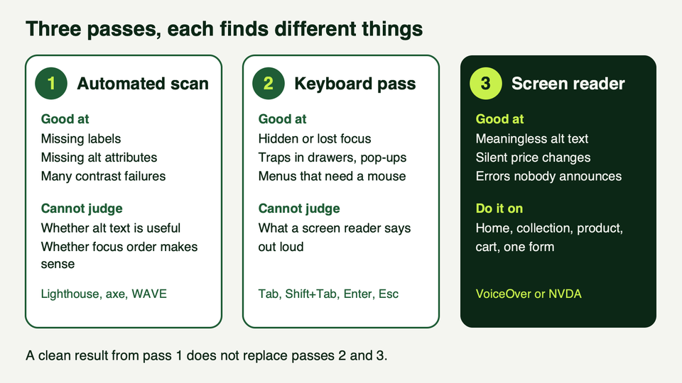
Pass 1: automated. Shopify names Accessibility Insights, Lighthouse and WAVE, and offers a Lighthouse CI action for theme developers. We ran Lighthouse 13.5.0 on Shopify's public Dawn demo store on 17 October 2026.
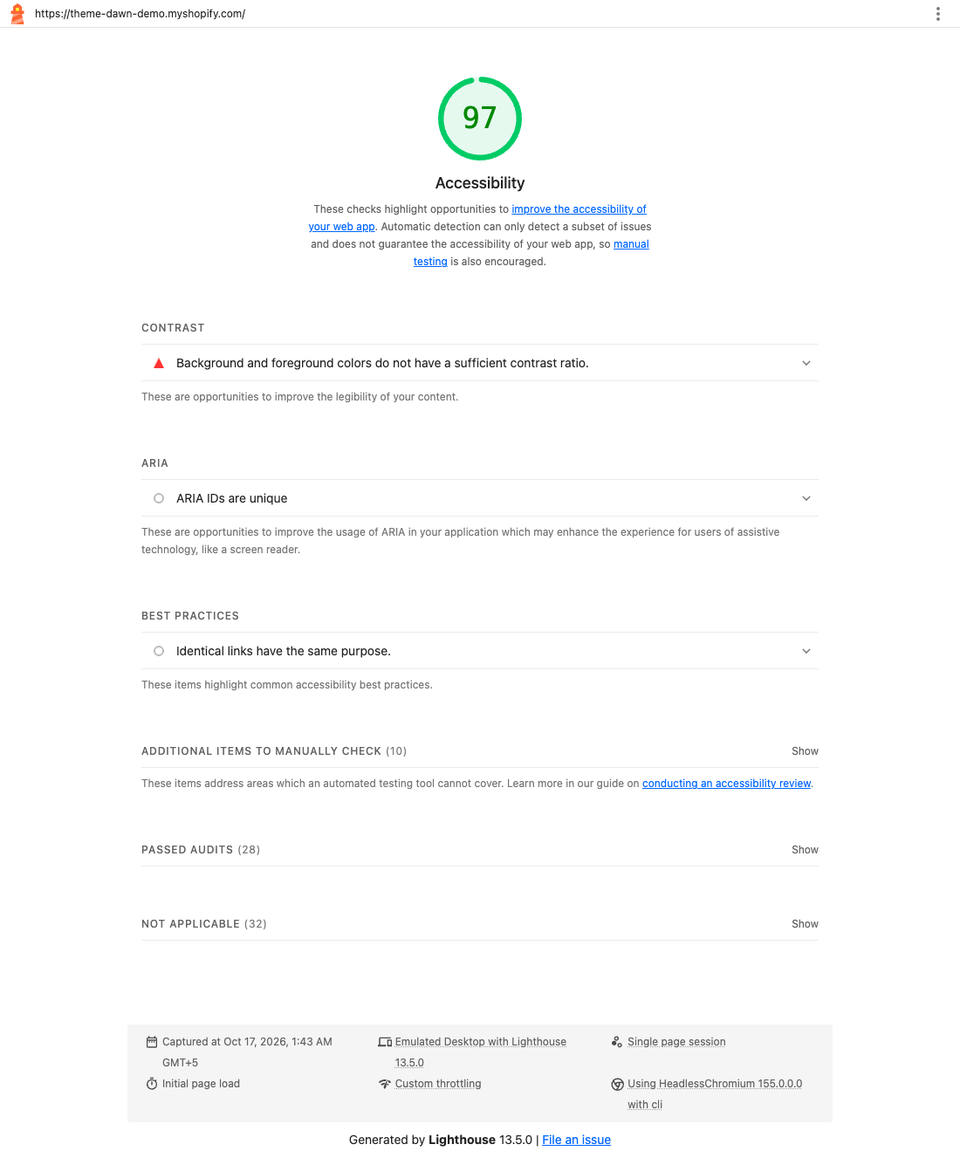
It scored 97 on desktop and mobile, with one failed audit: contrast. The report itself says automatic detection finds only a subset of issues, and it left ten items for manual checking. In the mobile run it flagged 21 elements as near-white text on white (#fdfdfd on #ffffff).
That looked odd, so we ran axe-core 4.14.0 on the same page. Straight after load it reported 13 contrast violations. After we scrolled the whole page and waited, it reported none. The flagged elements carried the theme's scroll-reveal classes, and Dawn's "Reveal sections on scroll" setting is on in its sample data. Our reading is that the scanners caught text mid-fade, not a real contrast problem. A scanner can be wrong in both directions, so look before you change anything. Even after the page settled, axe left three contrast checks as "needs review" for text over the hero photo, because it could not work out the background. A person has to check those.
Pass 2: keyboard. W3C's Easy Checks are a good start. Tab through the home page, a collection, a product, the cart and one form. Can you see focus, operate everything, and leave every drawer with Esc? Then zoom to 400 percent (about 320 CSS pixels wide) and check that content reflows without sideways scrolling (WCAG 1.4.10).
Pass 3: screen reader. Use VoiceOver on Apple devices or NVDA on Windows, with WebAIM's short guides (VoiceOver, NVDA). Listen for filler alt text, price changes nobody announces, unlabelled buttons and silent errors.
Repeat after every theme update, new section and app install, because apps add markup you answer for. Add these checks to your launch checklist.
The legal picture, in plain words (not legal advice)
We build themes. We are not lawyers, and the rules differ by country and by business, so read the sources and ask a lawyer about your own case.
European Union. The European Accessibility Act, Directive (EU) 2019/882, covers e-commerce services, and its measures apply from 28 June 2025 to services provided to consumers after that date. Microenterprises providing services are exempt: fewer than 10 people and turnover or balance sheet total not above 2 million euros. Penalties are set country by country (Directive text on EUR-Lex). Whether it reaches a seller outside the EU is a question for national law.
The Act does not name WCAG. The technical yardstick is the European standard EN 301 549. In an AccessibleEU report dated 7 September 2026, the legal reference was still version 3.2.1 (2021), based on WCAG 2.1 AA. Version 4.1.1 adopts WCAG 2.2 but had not been formally cited in the Official Journal, and we could not confirm any change since (AccessibleEU). That is one more reason to aim at 2.2 AA.
United States. The Department of Justice says the ADA covers businesses open to the public, including what they offer on the web, and that it has no regulation setting detailed web standards. It points to WCAG as helpful guidance (ADA.gov guidance, March 2022). The 2024 rule naming WCAG 2.1 AA applies to state and local governments, with compliance dates later extended to April 2027 and April 2028 (ADA.gov fact sheet). It is not a rule for shops.
Frequently asked questions
Is the Dawn theme accessible out of the box?
Dawn is a strong starting point: its source includes a skip link, focus outlines, a pausable slideshow and labelled errors. But Shopify's published conformance report is from 2021 for an old version, and your colours, images, apps and edits change the result. Treat Dawn as a head start and test your live store.
Does a high Lighthouse score mean we pass?
No. Shopify requires an average of 90 or more for Theme Store themes, but Lighthouse itself says automatic detection finds only a subset of issues. It left ten items for manual checks on the Dawn demo store. Use the score to catch easy problems, then do the keyboard and screen reader passes.
Should we target WCAG 2.1 or 2.2?
Target 2.2 AA. It keeps the 2.1 criteria, apart from the obsolete 4.1.1, and adds new ones. Some current legal references still cite 2.1 AA, so 2.2 covers both, and you will not need to redo the work when the references move.
Can an add-on script make our store accessible?
We found nothing in WCAG, Shopify's documentation or the DOJ guidance saying a script on top replaces fixing the theme's code. Unlabelled fields, hidden focus and missing alt text sit in the markup, so fix them at the source and treat any extra tool as a convenience.
What can a merchant fix without a developer?
Plenty. Write alt text in the media editor, choose colour schemes that pass a contrast check, keep headings in order inside pages, write link text that makes sense alone, caption videos and switch off autoplay. Developers are needed for focus styles, custom sections, drawers and form code.
Where we can help
We build and maintain Shopify themes, and we can audit your live store against the checks above and fix what we find in your theme code. See our services, or get in touch with the page you are most worried about. For related reading, see our guides on custom theme development and customizing the Dawn theme.