Shopify Custom Theme Development: A Practical Guide
Build a custom Shopify theme when your design, content model or performance goals cannot be reached by adapting an existing theme. Otherwise adapt one. Developers start from Shopify's Skeleton theme or Dawn with Shopify CLI, check the code with Theme Check, deploy through GitHub, and plan for ongoing maintenance, because a custom theme has no vendor updating it for you.
Build a custom Shopify theme when the design, the content model or the performance target cannot be reached by adapting an existing theme. If a well-built theme gets you most of the way, adapt it and spend the saved effort elsewhere. A custom theme is code you own, which means you also own its upkeep.
This guide is for store owners deciding whether to commission a theme, and for developers about to start one. It was rewritten and checked against Shopify's documentation and repositories on 17 October 2026. One change matters for anyone starting today: Shopify's Skeleton Theme was rebuilt on 1 October 2026 around a block-first model, so read the starting point section before you run any commands.
Custom, adapted or off the shelf: how to decide
Three routes exist. Most stores should take the cheapest one that works.
| Route | Fits when | Watch out for |
|---|---|---|
| Use a theme as it is | Your catalogue and brand fit the theme's settings | You look like other stores on the same theme |
| Adapt an existing theme | You need new sections, a different header, a few templates or custom CSS | Edits drift from the upstream theme |
| Build a custom theme | The layout, data model or behaviour is the product itself | You own every bug and every platform change |
Custom earns its cost when product pages need structure no theme offers (configurators, bundles, rich metafield content), when several markets or brands need one system with different content, or when a measured speed or accessibility problem comes from the theme's architecture rather than from apps or images.
It does not earn its cost when the goal is only to look more premium, when the store has not found its audience yet, or when nobody will own the code afterwards. Our guides to choosing a Shopify theme, free themes and best practices for theme customization cover the cheaper routes, and adapting is often the honest answer. If you take it, start with customizing Dawn.
Tooling and starting point
Install Shopify CLI
Shopify CLI is the main tool. Its documentation lists Node.js 22.12 or higher, a package manager (npm, Yarn 1.x or pnpm) and Git 2.28.0 or higher. Install it globally:
npm install -g @shopify/cli@latest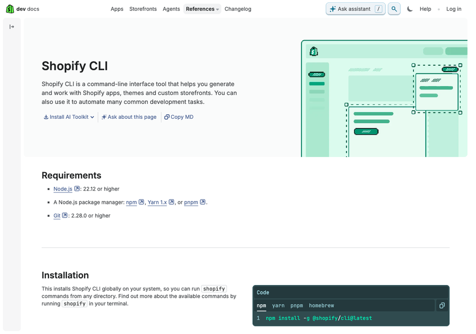
On the day we checked, npm listed version 4.9.4, published on 16 October 2026. Since CLI 4.0 it upgrades itself, which you can turn off with shopify config autoupgrade off.
Create a development store and make sure you are its owner, or have a staff or collaborator account with the Themes permission. The Shopify Liquid extension for VS Code adds highlighting, linting and inline documentation, and includes Theme Check. Development themes are the safe place to work: they are temporary, hidden themes connected to your store, they do not count towards the theme limit, and Shopify deletes them after seven days of inactivity.
Skeleton Theme
Do not start from an empty folder. Only layout/theme.liquid is required for an upload to work, but you would be rebuilding what Shopify already solved. shopify theme init clones Shopify's Skeleton Theme unless you point it elsewhere, and the current tutorial on shopify.dev uses it.
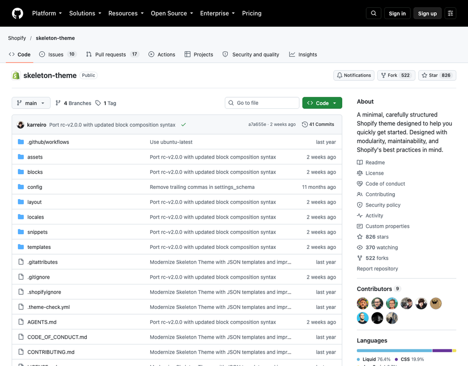
Here is the change. The repository's main branch now describes a "block-first" theme: templates compose each page from blocks, snippets and inline markup, with no sections and no JSON templates. The latest commit is dated 1 October 2026 and titled "Port rc-v2.0.0 with updated block composition syntax". The only tagged release, v1.0.0 from May 2025, still used JSON templates.
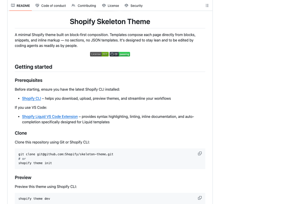
Shopify documents the matching {% block %} Liquid tag, which renders a file from blocks/ straight from a template. We could not find a changelog post announcing it, so treat it as new. The repository's agent guide also says its {% partial %} tag only renders when a store-level feature flag is on. We did not run shopify theme init for this guide, so check what you receive: a sections folder and JSON templates mean the older layout, while templates/index.liquid means block-first. The -l flag downloads the latest release instead.
Dawn and Horizon
Dawn is Shopify's reference theme for sections, JSON templates and app blocks, with an HTML-first, JavaScript-only-as-needed approach. Its latest release, v16.0.0 (10 August 2026), removes the legacy customer account templates, so stores on legacy accounts must upgrade first. Dawn is source available, not standard open source: its licence allows use to develop themes that integrate with Shopify and prohibits other uses. Its README shows how to pull later changes through an upstream Git remote.
Horizon is described as the flagship of a new generation of first-party themes and uses theme blocks. Its README says themes built on it are not eligible for the Theme Store and recommends Skeleton as the starting point.
| Skeleton (main) | Dawn | Horizon | |
|---|---|---|---|
| Page model | Blocks in Liquid templates | Sections in JSON templates | Theme blocks |
| Merchants reorder sections in the editor | Not the model | Yes | Blocks can be added and reordered within sections |
| Best for | Developer-led, small codebase | Merchant-edited stores | Studying a current first-party design |
Our advice: if the merchant will rearrange pages in the theme editor, build on sections and JSON templates, the model Online Store 2.0 introduced. If a developer controls page structure and wants the smallest codebase, trial the block-first Skeleton on a development store. Write the decision down.
How a theme is organised
Shopify's architecture page lists the allowed top-level folders and says other subdirectories are not supported.
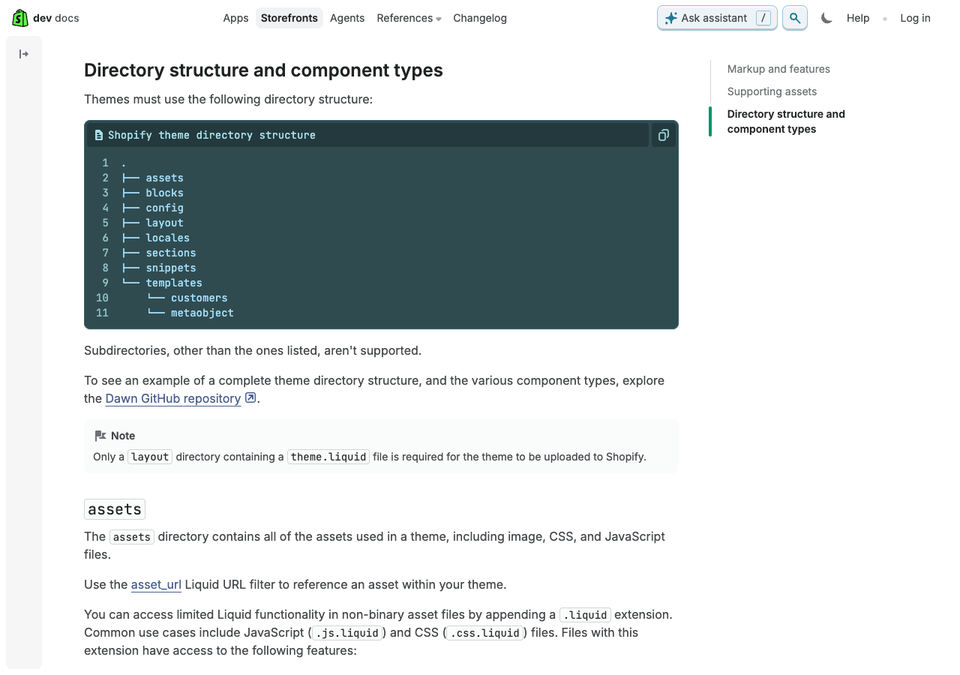
| Folder | What it holds |
|---|---|
| layout | Page shells such as theme.liquid. The only required file |
| templates | One file per page type. JSON templates list sections, Liquid templates contain code |
| sections | Reusable modules merchants can add, plus JSON section groups for header and footer |
| blocks | Theme blocks reusable across sections |
| snippets | Shared Liquid, invisible to merchants |
| assets | CSS, JavaScript, images |
| config | Theme settings and their saved values |
| locales | Translations |
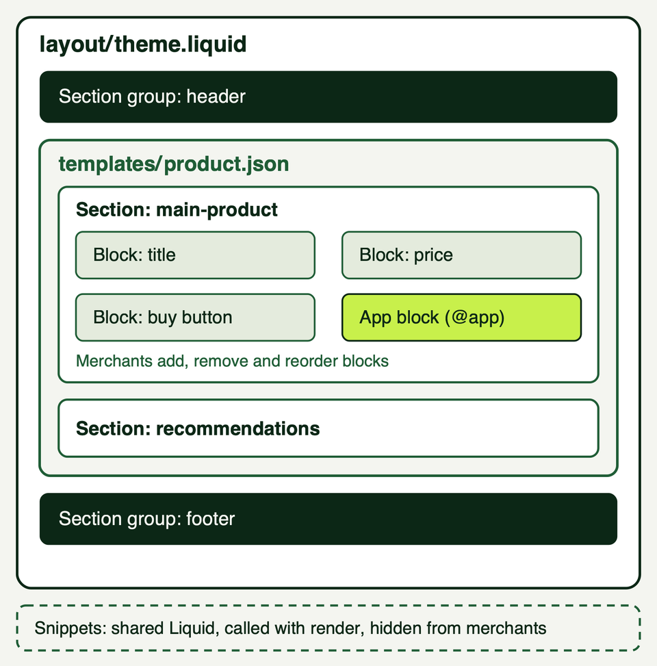
Know the limits before designing templates: JSON templates render up to 25 sections, each section holds up to 50 blocks, and a theme can have up to 1,000 JSON templates and 300 theme blocks. For the section system in depth, see sections and blocks explained and our Liquid guide.
A minimal working example
This callout list uses the section model, because that is what merchants edit in the theme editor. It is one section with a schema, one snippet and one JSON template, written for a new theme.
{{ 'callout-list.css' | asset_url | stylesheet_tag }}

<div class="callout-list">
  {%- if section.settings.heading != blank -%}
    <h2 class="callout-list__heading">{{ section.settings.heading | escape }}</h2>
  {%- endif -%}

  <div class="callout-list__items">
    {%- for block in section.blocks -%}
      {%- case block.type -%}
        {%- when '@app' -%}
          {% render block %}
        {%- when 'callout' -%}
          <div class="callout-list__item" {{ block.shopify_attributes }}>
            {%- render 'callout-item',
              title: block.settings.title,
              text: block.settings.text,
              link: block.settings.link
            -%}
          </div>
      {%- endcase -%}
    {%- endfor -%}
  </div>
</div>

{% schema %}
{
  "name": "Callout list",
  "tag": "section",
  "class": "callout-section",
  "settings": [
    { "type": "text", "id": "heading", "label": "Heading", "default": "Section heading" }
  ],
  "blocks": [
    {
      "type": "callout",
      "name": "Callout",
      "limit": 6,
      "settings": [
        { "type": "text", "id": "title", "label": "Title", "default": "Callout title" },
        { "type": "text", "id": "text", "label": "Text", "default": "One short supporting line." },
        { "type": "url", "id": "link", "label": "Link" }
      ]
    },
    { "type": "@app" }
  ],
  "presets": [
    {
      "name": "Callout list",
      "blocks": [{ "type": "callout" }, { "type": "callout" }, { "type": "callout" }]
    }
  ]
}
{% endschema %}
{% doc %}
Renders one callout.
@param {string} title - Short heading
@param {string} [text] - Supporting line
@param {string} [link] - Optional URL for the whole callout
{% enddoc %}
<div class="callout">
<h3 class="callout__title">
{%- if link != blank -%}
<a class="callout__link" href="{{ link }}">{{ title | escape }}</a>
{%- else -%}
{{ title | escape }}
{%- endif -%}
</h3>
{%- if text != blank -%}
<p class="callout__text">{{ text | escape }}</p>
{%- endif -%}
</div>{
"sections": {
"callouts": {
"type": "callout-list",
"settings": { "heading": "Section heading" },
"blocks": {
"first": { "type": "callout", "settings": { "title": "First point" } },
"second": { "type": "callout", "settings": { "title": "Second point" } }
},
"block_order": ["first", "second"]
}
},
"order": ["callouts"]
}What each part does:
presetsis what lets merchants add the section from the theme editor. Without it the section has to be placed in the JSON by hand and cannot be removed in the editor.{ "type": "@app" }lets apps contribute blocks, and thecasebranch renders them. Shopify's documentation says@appblocks do not accept alimitand are not supported in statically rendered sections.- The snippet documents its parameters with
{% doc %}, which the VS Code extension uses for hints. Put logic in snippets and settings in sections. - Text settings go through
escape, because a theme should not trust a text field. block.shopify_attributeslets the theme editor select that block. Styles go inassets/callout-list.css.
Run it with shopify theme dev --store your-store. Shopify hot reloads CSS and section changes at http://127.0.0.1:9292, in Google Chrome. Then run shopify theme check.
Architecture decisions that pay off
Design tokens as CSS variables
Put every colour, font and spacing value in one place and let theme settings feed it. The Skeleton Theme does this in a css-variables snippet that prints a :root block from settings. A version of the idea:
{% style %}
  :root {
    --color-background: {{ settings.color_background }};
    --color-text: {{ settings.color_text }};
    --color-accent: {{ settings.color_accent }};
    --space-s: 0.5rem;
    --space-m: 1rem;
    --space-l: 2rem;
    --page-width: {{ settings.max_page_width }};
  }
{% endstyle %}
Define the settings in config/settings_schema.json:
[
  {
    "name": "Colors",
    "settings": [
      { "type": "color", "id": "color_background", "label": "Background", "default": "#ffffff" },
      { "type": "color", "id": "color_text", "label": "Text", "default": "#1a1a1a" },
      { "type": "color", "id": "color_accent", "label": "Accent", "default": "#1f5d36" }
    ]
  },
  {
    "name": "Layout",
    "settings": [
      { "type": "text", "id": "max_page_width", "label": "Maximum page width", "default": "90rem" }
    ]
  }
]
Components read var(--color-accent) and never a hard-coded hex value. Merchants change the brand in one place, and you check contrast on a few colour pairs instead of every component. Shopify exposes its own custom CSS setting on sections and says theme developers should not add one. For merchant CSS, see adding custom CSS to Shopify.
Treat apps as guests
Every app can add scripts, styles and markup. Set rules early.
- Prefer apps built as theme app extensions. Shopify says they do not edit theme code, which lowers the risk of breaking the theme, and merchants place them through app blocks.
- Support
@appblocks in every section where a merchant might want one. - Keep a list of installed apps and what each one loads, and audit it each quarter. Shopify's performance guidance rates removing render-blocking apps as high impact.
- Never let an app replace content that should render on the server, such as product information. Our review apps comparison shows what to look for.
A performance budget
Write the budget before the build. Web.dev gives the Core Web Vitals targets: Largest Contentful Paint within 2.5 seconds, Interaction to Next Paint of 200 milliseconds or less, and Cumulative Layout Shift of 0.1 or less, at the 75th percentile. For the Theme Store, Shopify sets a floor of an average Lighthouse performance score of 60 across home, product and collection pages. That is a floor, not a target.
From Shopify's best practices, the highest-impact rules are: never lazy-load the Largest Contentful Paint image and give it fetchpriority="high"; render essential content in Liquid, not JavaScript; avoid nested Liquid loops and metafield access inside loops; use image_tag and image_url; and defer or remove scripts, including apps. The Shopify Theme Inspector for Chrome shows slow Liquid lines. More in our theme performance guide.
Accessibility from the first commit
Retrofitting is slow. Shopify's accessibility best practices make a ready checklist. Build in from day one: a visible focus indicator and a focus order that matches the visual order, a skip link, a lang attribute, zoom left enabled, heading levels in order with one h1, real button and a elements, a label on every form field, alt text on product images and empty alt on decorative ones, and aria-live for price and availability changes.
WCAG 2.2 criterion 1.4.3 asks for a contrast ratio of at least 4.5:1 for most text, which tokens make checkable. Shopify warns that following its list does not guarantee full accessibility, so test with real tools. More in our accessibility guide.
Testing and deployment
Theme Check
Theme Check is Shopify's linter for the Liquid and JSON in a theme. It catches syntax errors, missing templates, unused variables and snippets, deprecated tags and some performance issues:
shopify theme checkThe command also has --auto-correct and a --fail-level flag that sets the minimum severity for a failing exit code. The Skeleton keeps a .theme-check.yml with one line, extends: theme-check:recommended, and its agent guide says to fix the code instead of adding exceptions. Run it on every push; the Skeleton's own workflow uses Shopify's action:
# file: .github/workflows/ci.yml
name: CI
on: [push]
jobs:
  theme-check:
    name: Theme Check
    runs-on: ubuntu-latest
    steps:
      - uses: actions/checkout@v4
      - name: Theme Check
        uses: shopify/theme-check-action@v2
        with:
          token: ${{ github.token }}
Linting does not replace hand testing: use the keyboard only, test on a real phone, try a product with many variants, and check every template, including cart, search and 404. Dawn's README also points to a Lighthouse CI action.
Deploying with GitHub
Shopify's GitHub integration connects a branch to a theme. When the branch changes, the theme updates. When someone saves in the theme editor or code editor, Shopify commits that change to the branch, and this cannot be disabled. Only branches that match the default theme folder structure can be connected.
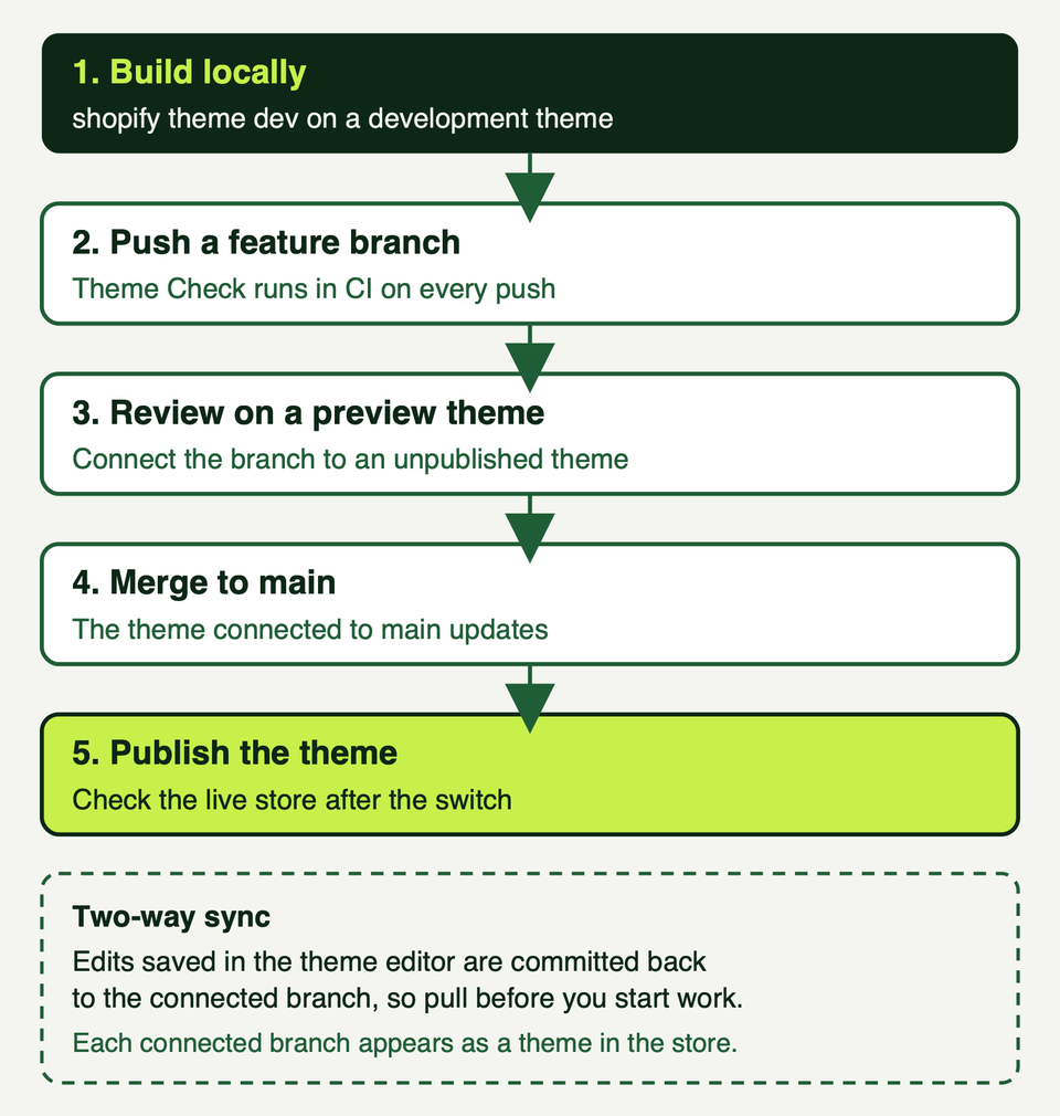
Shopify's version control guidance suggests connecting main to the published theme and using other branches for campaigns. If you compile code with a build pipeline, keep source and compiled code apart, for example on a deploy branch, because the connected branch cannot contain folders like src and dist.
You connect a repository in the admin under Online Store, Themes, Add theme, Connect from GitHub; see Shopify's GitHub integration documentation. From the command line, shopify theme push --unpublished uploads a new unpublished theme, shopify theme push updates it and shopify theme publish makes it live. Scripted pushes from CI need CLI 3.20 or higher and a Theme Access password. Shopify's CI example uses Node 20, while the CLI page asks for 22.12 or higher, so use the newer one.
Ongoing maintenance
A custom theme does not update itself. Plan for:
- Pull before you push. Merchants edit in the editor and Shopify commits those edits.
- Upstream changes. If you started from Dawn, merge its releases deliberately. v16.0.0 shows why: stores had to upgrade customer accounts first.
- Tooling. Update Shopify CLI and re-run Theme Check, which flags deprecated tags.
- Apps and speed. Re-audit apps each quarter and recheck Core Web Vitals after larger changes.
- Documentation. Shopify supports optional
AGENTS.mdandDESIGN.mdfiles at the theme root that explain how the theme is built and its design intent, for coding agents and for Sidekick. They sync with CLI 4.8.4 and higher and with the GitHub integration.
How a project is usually scoped
We scope in phases with a decision at the end of each, instead of one number up front.
- Audit and goals. What the current theme does, which apps it carries, what is slow or inaccessible, and what success means.
- Design system. Tokens, type, spacing and the small set of components the store reuses.
- Build. Layout, templates, sections and blocks, starting with the revenue pages: product, collection, home, cart.
- Integrations and data. Metafields, apps and their blocks, markets and languages.
- Quality gates. Theme Check, the performance budget, accessibility testing and checks on real devices.
- Content and staging. Moving content, previewing on an unpublished theme, sign-off.
- Launch. Publishing, redirects and a rollback plan; our launch checklist covers it.
- Handover and upkeep. Documentation, editor training and an agreed maintenance routine.
If a quote skips the quality gates or the handover, it is incomplete. The reasons to choose a good theme are worth reading before you decide.
Frequently asked questions
Can I build a Shopify theme from scratch without a starter?
Yes. Shopify's architecture page says only a layout folder containing theme.liquid is required for an upload. In practice it is slower and riskier, because you rebuild solved problems such as cart handling, translations and editor support. Starting from Skeleton or Dawn gives you tested structure to adjust.
Will merchants still be able to edit content?
It depends on the model. Sections with JSON templates and presets let merchants add, remove and reorder sections in the theme editor. The block-first Skeleton, per its README, uses no sections and no JSON templates, so page structure lives in code. Decide who needs to rearrange pages before choosing.
Can I use Dawn code on a client store?
Dawn's licence permits using it to develop themes that integrate with Shopify and prohibits other uses. A store theme fits that description, but read the licence yourself, and take legal advice if you plan to use the code for anything beyond building store themes. We are not lawyers.
Do I need GitHub?
No. Shopify describes version control as optional, and the GitHub integration is one way to do it. We still recommend a repository for history, review and a way back. Without the integration you can keep the repository elsewhere and push with Shopify CLI.
What happens to my current theme?
Adding a theme does not remove the old one. According to the Help Center, stores on the Basic, Grow and Advanced plans can hold up to 20 themes and Plus stores up to 100, so keep the old theme until the new one has been live and checked.
Where we can help
We build and maintain Shopify themes, and we also tell store owners when adapting is the better choice. If you want a second opinion on the route, a theme audit or a phased build, see our services or get in touch.